Figma Case Study
A food ordering and delivery mobile app that lets users discover restaurants, customize meal combinations, and track their delivery from checkout to doorstep.
Screens:
Onboarding to
Checkout
Flow
End-to-End
Ordering
Platform
Mobile
(iOS/Android)
Approach
Figma, High-Fidelity Prototype
Meala is a mobile food ordering app designed to make discovering restaurants and getting food delivered feel fast, warm, and effortless. The goal was to design a complete ordering experience, from first launch through account creation, browsing, and order tracking, that felt inviting rather than transactional.
Food delivery apps live or die on speed and trust: users need to feel confident a restaurant is good, an order is accurate, and delivery is on the way, all within a few taps. The challenge was to design an experience that made browsing feel appetizing and browsing-to-checkout feel effortless, without the clutter that many food apps fall into once categories, filters, and cart states pile up.
A cohesive visual system built around warmth, appetite, and clarity.
Warm orange (#F74F01) as the primary action color across every CTA — Continue, Login, SignUp — layered over full-bleed food photography with soft gradient overlays for legibility. Headline text sits in near-black (#000000) for maximum contrast on light cards, supporting copy in a softer charcoal (#4B4B4B), with off-white surfaces (#F7F8F9) grounding the lighter screens and a muted grey (#B1AFAF) reserved for secondary, lower-emphasis actions like social sign-in.
#000000
Typograaphy
A bold, rounded sans-serif carries headlines like "Discover And Craft Your Own Food" and "Welcome Back!", giving the app a friendly, appetite-driven voice. A lighter-weight sans-serif handles body copy, form labels, and supporting text, keeping dense screens like login and signup easy to scan.


Design Objectives
Create a mobile ordering experience that feels fast and appetizing from first open to final delivery, reducing friction at every step between craving and checkout.

Target
Audience
Busy, mobile-first urban users who want a quick, reliable way to discover restaurants and get food delivered without friction, from students to working professionals ordering on the go.

Design
Goals
Develop a warm, food-forward visual identity, a clear category-based browsing structure, and a streamlined checkout and tracking flow that keeps users oriented at every stage of the order.
A systematic approach from research through high-fidelity
Research & Discovery
Looked at how leading food delivery apps structure onboarding, browsing, and checkout, and identified where users typically drop off (menu overload, unclear delivery status, slow checkout).
01
Structured the app around three core flows: discovery (restaurants and categories), ordering (menu, cart, customization), and tracking (order status, delivery). Mapped clear pathways between each.
02
Visual Design System
Built a component library in Figma covering buttons, input fields, category cards, and restaurant/menu cards, anchored by a warm, appetite-driven color and imagery direction.
03
Designed full-fidelity screens for on-boarding, authentication, restaurant browsing, menu selection, and checkout, using real food photography to keep the experience visually appetizing.
04
Research into food delivery apps showed that the strongest ones lean on large, appetizing imagery and minimal friction between "I'm hungry" and "order placed." Meala's design leaned into full-bleed food photography on every key screen, paired with warm gradient overlays, to keep the experience feeling inviting rather than purely functional.
Thoughtful design choices that enhance the ordering experience
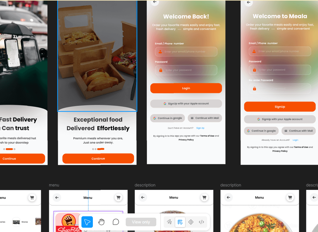
Three onboarding screens ("Discover and Craft Your Own Food," "Ultra-Fast Delivery You Can Trust," "Exceptional Food Delivered Effortlessly") each pairing large food or delivery photography with a clear value proposition and a single "Continue" CTA.
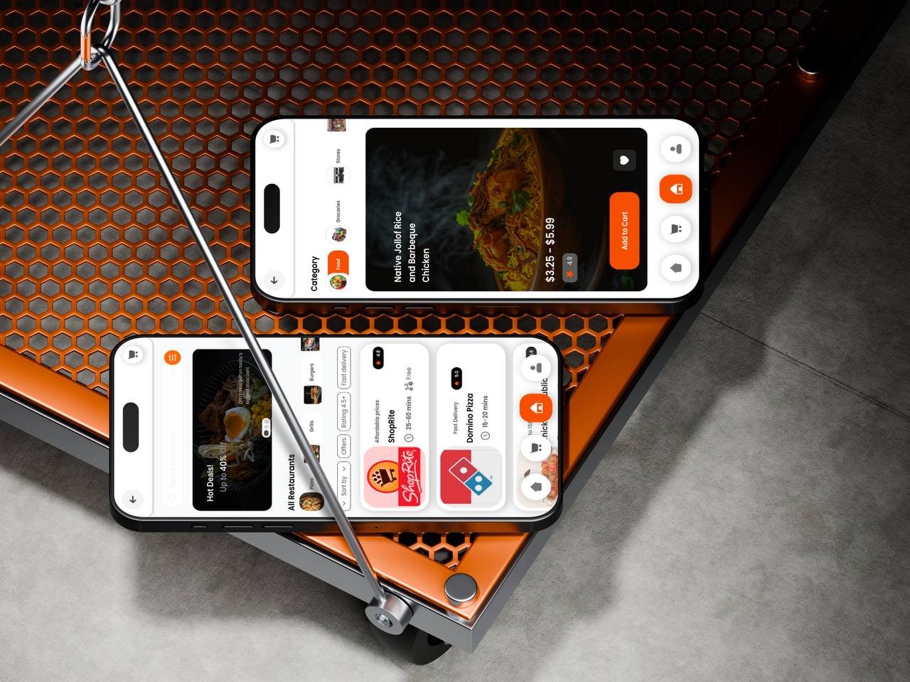
Restaurant and menu screens organize content into clear categories (Food, Groceries, Stores) with icon-led navigation, letting users narrow down options quickly instead of scrolling one long list.
Search bars, back buttons, and cart icons are placed consistently across every screen, so users always know how to search, go back, or check their order regardless of which flow they're in.
Login and signup screens use a soft, warm gradient background over blurred food imagery, keeping the brand's appetite-driven feel present even on functional screens like "Welcome Back!" and "Welcome to Meala."
Deal callouts (e.g. "Hot Deals — Up to 40% Off") are surfaced directly on the restaurant browsing screen, encouraging discovery without requiring users to dig for offers.
The biggest challenge was keeping the experience visually rich with full food photography on nearly every screen, including functional ones like login and signup, without letting that imagery compromise legibility or usability.
Used consistent gradient overlays behind text and form fields on every image-heavy screen, so contrast stayed high for readability while the warm, appetizing visual identity carried through the entire flow, from first launch to checkout.